As Broadoak continue to evolve, moving from strength to strength they felt it was time their brand identity reflected a more modern, contemporary style.
Turning to Intimation Broadoak tasked us with developing a new logomark that successfully stood up alongside their competitors as well as refreshing their website, developing a stylish, modernised version with a clear, concise run through.
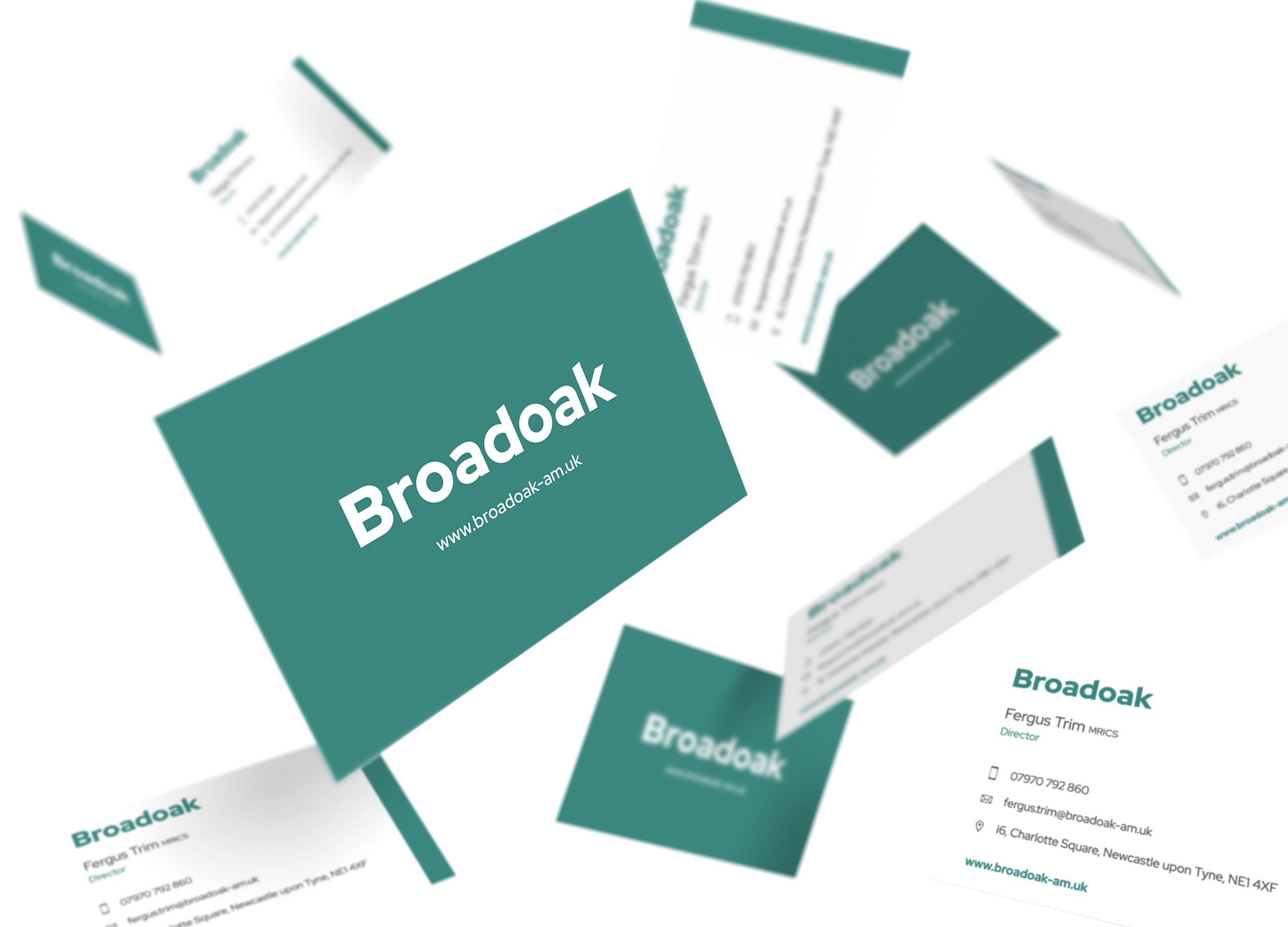
Beginning the process we stripped back the logo, removing the previously used leaf icon and ‘asset management’ strap line. Being a notable player within the pool of asset management companies around the North East, we felt there was a strength in simplifying the identity, relying on the confidence of being recognised as simply ‘Broadoak’.
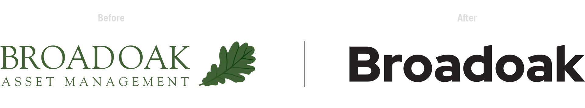
Using a sans-serif typeface with a crisp, clean aesthetic allowed the logo to be direct and confident in its approach, while the subtle cuts of the types ascenders added to the personality of the mark. A vibrant colour palette for the brand’s new identity was developed using rich blue/grey tones, coupled with considered use of energetic orange and green elements to add a liveliness to the designs.
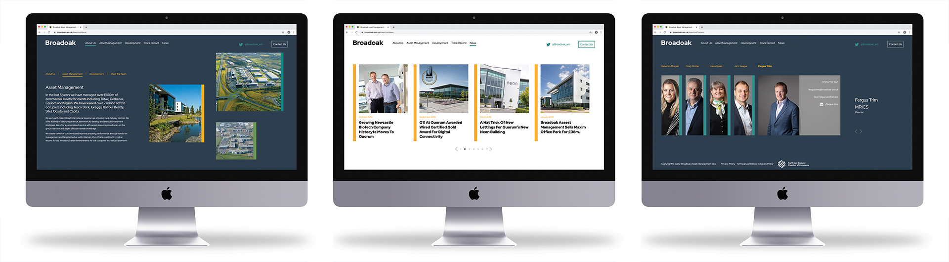
The website was based on a single frame page structure, allowing navigation to be straight forward and clear to all audiences. Subtle animations and movement within the site further developed the personality of the brand and made the user journey more interesting and engaging. The newly developed colour palette gave the site some light and shade when moving from page to page, while the colour bars added a pop of colour and worked as a valuable resource when anchoring content and imagery.
Click here
to check out their brand new site now!