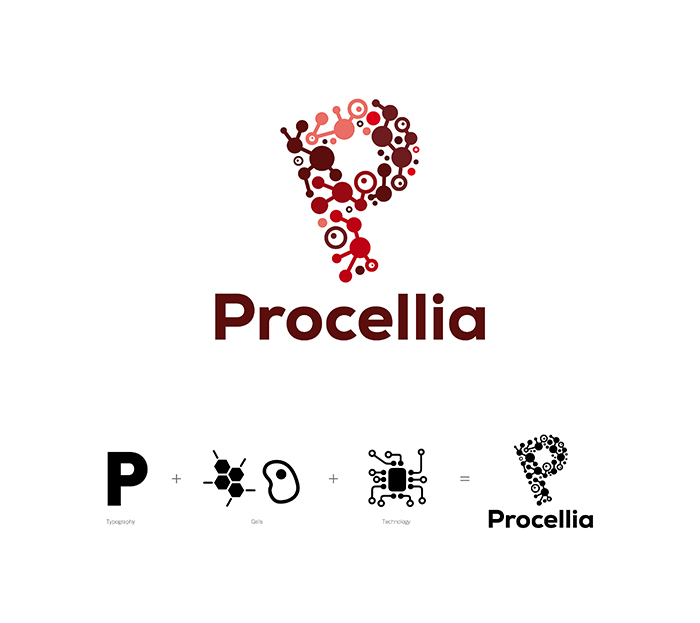
Can you spot the different elements included in Procellia’s new logo? Take a look at the design inspiration behind their new brand identity.

Procellia is a new company set up in the North East by a client of Intimation, providing the technology and monitoring systems for measuring cells for pharmaceuticals.
The design team in Newcastle took inspiration from the company’s products, utilising the visual appearance of biological cells, as well as technology, to create the new, distinct P Marque. The colours chosen for the new identity are all varieties of red, the colour of blood. These colours were chosen to reflect the nature of both the company and the medical industry.
The new Procellia brand identity will be used across a range of promotional materials as the company aims to grow the brand.

